
Design or Speed? Why a Successful Website Needs Both التصميم أم السرعة؟ لماذا يحتاج موقع الويب الناجح إلى كليهما
Related Articles






Design or Speed?
Why a Successful Website Needs Both
If you had to choose between a website that looks incredible and a website that loads extremely fast, which one would you choose?
It sounds like a simple question.
On one side, you have a visually impressive website: beautiful layouts, smooth animations, immersive interactions, premium visuals, and a design that immediately catches attention.
On the other side, you have a fast website: pages load quickly, buttons respond immediately, content appears without unnecessary delays, and the entire experience feels smooth.
So which one matters more?
The truth is: you shouldn't have to choose.
A successful website needs both.
It needs a design that makes the experience clear, comfortable, and engaging — and it needs performance that makes the website feel fast, responsive, and effortless to use.
Because your customer isn't visiting your website just to admire the animations.
They're visiting because they want to do something.
They want to understand a service.
They want to buy a product.
They want to book an appointment.
They want to contact your company.
They want to find an answer.
And the website needs to help them get there.
A Beautiful Website Is Not Enough
There is nothing wrong with wanting your website to look amazing.
In fact, design matters.
The visual experience is often the first impression someone gets from your business.
A well-designed website can communicate professionalism, build trust, create a strong brand identity, and make a company feel more established.
Good design can also make complicated information easier to understand.
It can guide attention.
It can organize content.
It can make navigation feel intuitive.
It can turn a complicated process into a simple one.
But there is a difference between good design and simply adding more visual effects.
More animations don't automatically mean a better experience.
More transitions don't automatically mean a more premium website.
More interactive elements don't automatically mean more engagement.
Design should serve the user.
And that's where performance becomes just as important.
What Happens When a Beautiful Website Is Slow?
Imagine clicking on a website because the advertisement, search result, or recommendation caught your attention.
You open it.
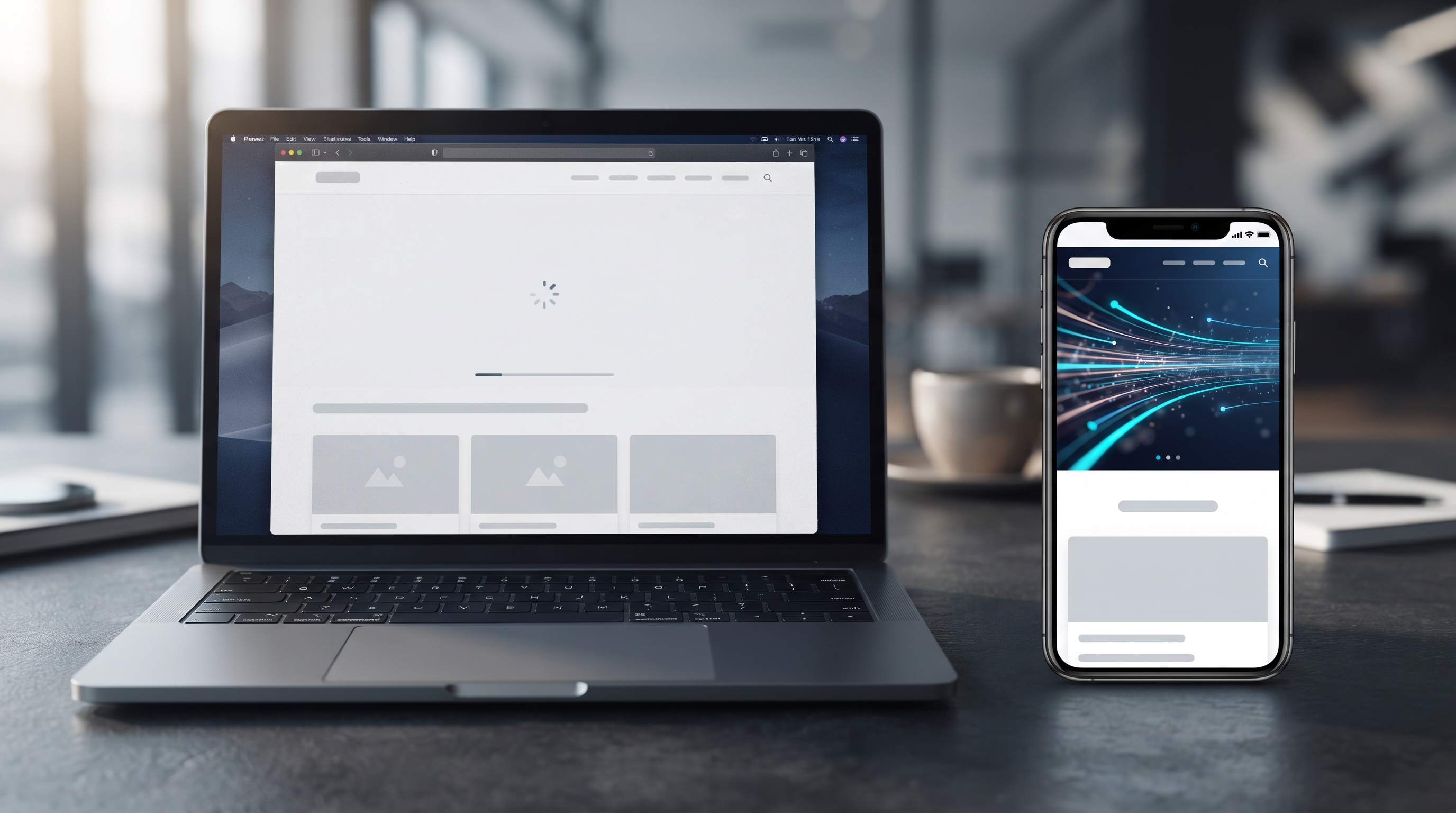
The screen starts loading.
Then you wait.
Maybe the images haven't appeared yet.
Maybe an animation is loading.
Maybe the page is still processing scripts.
You wait a little longer.
At this point, the customer isn't thinking:
“Wow, this must be an incredibly sophisticated website.”
They're probably thinking:
“Why isn't this loading?”
And that's the problem.
If the website takes too long to become usable, the visitor may leave before experiencing the design you spent so much time creating.
The irony is that you can spend weeks creating an impressive visual experience, only for the visitor to never see it because the website didn't respond quickly enough.
A beautiful experience that people don't wait around to experience isn't doing its job.
The Customer Isn't There to Watch Your Animations
This is one of the most important things to remember when building a website.
Your customer has a goal.
They aren't visiting your website because they want to see how talented your development team is.
They don't necessarily care what framework you used.
They don't care how complicated the animations were to build.
They care about whether the website helps them accomplish what they came to do.
Maybe they want to:
Understand one of your services
Request a quote
Purchase a product
Book an appointment
Contact your team
Find your location
Compare options
Learn more about your company
Complete a specific task
The website should make those actions feel easy.
That's what good user experience is really about.
Design Gets Attention. Performance Keeps the Experience Moving.
Think of design and performance as two parts of the same experience.
Design gets attention.
It creates the first impression.
It communicates your brand.
It helps organize information.
It makes the experience visually engaging.
But performance keeps the experience moving.
It determines how quickly users can interact with the page.
It affects how smooth the experience feels.
It helps prevent unnecessary friction.
And it allows the design itself to actually be experienced.
You need both.
A website with great design but poor performance creates frustration.
A website with excellent performance but poor design may feel confusing, outdated, or difficult to navigate.
The goal isn't to sacrifice one for the other.
The goal is to make them work together.
Performance Is Part of the User Experience
It's easy to think of performance as something purely technical.
Developers might talk about things like:
Page load times
JavaScript execution
Image optimization
Caching
Server response time
Code efficiency
Content delivery
Rendering
Network requests
But for the customer, none of those technical terms really matter.
They experience performance as something much simpler:
Does the website feel fast?
Can they open the page?
Can they see the important content?
Can they click the button?
Can they scroll without the page feeling sluggish?
Can they move from one section to another without waiting?
Can they complete what they came to do?
That's why performance isn't just a technical concern.
It's part of the user experience.
Fast Doesn't Mean Boring
There's another misconception worth addressing.
Some businesses think that if they want a fast website, they have to create something extremely simple.
No animations.
No high-quality images.
No interactive elements.
No sophisticated visual experience.
That's not necessarily true.
A fast website can still be visually impressive.
You can have beautiful imagery.
You can have carefully designed animations.
You can have interactive components.
You can create a premium experience.
The key is to build those elements intelligently.
Instead of asking:
“How many effects can we add?”
Ask:
“Which effects actually improve the experience?”
That's a much better starting point.
Not Every Animation Adds Value
Animations can be powerful when they're used for a reason.
A subtle transition can help users understand that one section is connected to another.
A hover interaction can communicate that an element is clickable.
A carefully designed animation can draw attention toward an important part of the page.
Motion can make a digital experience feel more natural and responsive.
But animation becomes a problem when it exists simply because it looks impressive.
If every element moves, every section transitions, and every interaction has an elaborate effect, the website can become distracting.
And if those effects also hurt performance, you've created a problem twice.
The best animation is often the one that feels natural enough that the user barely thinks about it.
The First Priority Should Always Be the Customer
Before deciding whether a website needs a particular animation, effect, video background, or interactive feature, ask:
Does this help the customer?
If yes, explore how to implement it efficiently.
If not, ask whether it needs to exist at all.
This doesn't mean every website needs to be minimal.
Some brands genuinely benefit from immersive experiences.
A creative agency, luxury brand, entertainment company, or highly visual product may have good reasons to invest heavily in visual storytelling.
But even then, performance still matters.
The experience needs to balance visual impact with usability.
Think About the Entire Customer Journey
A website isn't just a homepage.
It's an experience that starts when someone arrives and continues until they accomplish their goal.
Imagine someone discovers your business through Google.
They click your website.
They land on the homepage.
They look for information about your services.
They visit a service page.
They read about what you offer.
They look at your portfolio or case studies.
They decide they want to talk to you.
They click your contact button.
They fill out a form.
Every step is part of the customer journey.
And every unnecessary delay can create friction.
That's why performance shouldn't be considered only during development.
It should be considered as part of the entire experience.
What If the Website Looks Incredible on Your Computer?
This is another common trap.
You test your website on a powerful computer with a fast internet connection.
Everything feels perfect.
The animations are smooth.
The images load quickly.
The transitions look beautiful.
So you assume the website is ready.
But your customer may be using a completely different device and connection.
They could be browsing from a phone.
They could have a slower connection.
They could be opening the website while traveling.
They could be using an older device.
A website needs to be designed for the actual conditions in which customers will use it — not just the ideal environment in which it was developed.
Mobile Makes This Even More Important
For many businesses, a significant portion of website traffic comes from mobile devices.
That means your website shouldn't simply be a desktop website squeezed onto a smaller screen.
The experience needs to be designed for mobile.
Navigation needs to make sense.
Buttons need to be easy to use.
Content needs to remain readable.
Images need to be optimized.
Interactions need to work naturally.
And the website needs to remain responsive.
A beautiful desktop experience doesn't automatically become a good mobile experience.
Both design and performance have to survive the transition.
The Goal Is Not Maximum Performance at Any Cost
There's an important distinction here.
The goal isn't necessarily to make every website as technically fast as physically possible while removing every visual element.
That's not always the right business decision.
Instead, the goal is to create the best overall experience for the specific website and its audience.
Sometimes a large, high-quality image is worth keeping because it communicates the product better.
Sometimes an animation is worth using because it explains a complex interaction.
Sometimes a video is an important part of the brand experience.
The question is not:
“Can we make this faster?”
The better question is:
“Can we preserve the experience while making it perform efficiently?”
That's where thoughtful design and development come together.
Good Development Makes Good Design Possible
A strong website isn't created by designers and developers working separately.
The best results happen when design and development are considered together.
A designer may create a beautiful interaction.
A developer can then determine how to implement it efficiently.
A developer may identify a technical limitation.
The design can then be adjusted without losing the original idea.
This collaboration helps prevent a situation where the design looks fantastic in a presentation but becomes difficult or expensive to implement properly.
The goal is to create something that looks good and works well in the real world.
Every Element Has a Cost
Not necessarily a financial cost.
A website element can have a cost in:
Loading time
Processing power
Visual complexity
Maintenance
Accessibility
Mobile usability
Development time
User attention
That's why every feature should have a reason for being there.
A website doesn't become better simply because more has been added.
Sometimes removing one unnecessary element can improve the entire experience.
The same principle applies to code, images, videos, third-party tools, animations, and integrations.
Every element should earn its place.
Don't Sacrifice the Brand to Make the Website Fast
At the same time, performance shouldn't become an excuse for creating a generic website.
Your website still needs personality.
Your brand should be recognizable.
Your visual identity should be consistent.
Your customers should feel that they're interacting with your company — not with a template that could belong to anyone.
The goal is balance.
You don't want:
Beautiful but frustrating.
And you don't want:
Fast but forgettable.
You want:
Beautiful, useful, and responsive.
The Best Websites Make the Balance Feel Natural
When a website is built properly, users don't think about the balance between design and performance.
They simply experience it.
The page opens quickly.
The visual design immediately communicates the brand.
The content is easy to understand.
The navigation feels natural.
Animations support the experience rather than interrupting it.
Buttons respond when they're clicked.
Pages transition smoothly.
The customer can find what they need without unnecessary friction.
That's what the balance should feel like.
Invisible.
The technology is doing its job without becoming the center of attention.
So, Design or Speed?
If someone asks you:
“Would you rather have an amazing-looking website or a fast website?”
The better answer isn't one or the other.
A successful website needs both.
Design should make the experience:
Clear
Attractive
Comfortable
Consistent
Easy to understand
Performance should make it:
Fast
Responsive
Reliable
Smooth
Accessible across real-world devices and connections
Neither one should completely replace the other.
Because your customers don't separate the website into “design” and “performance.”
They experience everything as one website.
Build for the Experience, Not the Screenshot
A website can look perfect in a design presentation.
But the real test begins when someone actually uses it.
Can they understand the message?
Can they navigate it?
Can they interact with it?
Can they do what they came to do?
Does the website respond quickly?
Does the experience remain strong on mobile?
Does the design help them rather than distract them?
And most importantly:
Does the website help the business achieve its goal?
That's the standard that matters.
A screenshot can show you how a website looks.
Only a real user experience can show you how well it works.
The Right Website Doesn't Force You to Choose
The strongest websites don't treat design and performance as enemies.
They treat them as parts of the same strategy.
A great design attracts attention.
A thoughtful user experience creates clarity.
Strong performance removes friction.
And together, they create a website that people actually want to use.
Because at the end of the day, your customer isn't visiting your website to admire the technology behind it.
They're there because they need something.
They want to understand.
They want to choose.
They want to buy.
They want to book.
They want to contact you.
Design helps them want to stay. Performance helps them keep going.
That's why you shouldn't have to choose between a website that looks powerful and one that performs well.
Build one that does both.
Want a website that's fast without sacrificing a strong visual experience?
Start with Vauxite.
Follow Vauxite — and stay one step ahead.
التصميم أم السرعة؟
لماذا يحتاج موقع الويب الناجح إلى كليهما
إذا كان عليك الاختيار بين موقع ويب يبدو رائعًا وموقع ويب يتم تحميله بسرعة كبيرة، فأي موقع ستختار؟
يبدو وكأنه سؤال بسيط.
من ناحية، لديك موقع ويب مثير للإعجاب من الناحية المرئية: تخطيطات جميلة، ورسوم متحركة سلسة، وتفاعلات غامرة، ومرئيات متميزة، وتصميم يلفت الانتباه على الفور.
على الجانب الآخر، لديك موقع ويب سريع: الصفحات يتم التحميل بسرعة، وتستجيب الأزرار على الفور، ويظهر المحتوى دون تأخيرات غير ضرورية، وتشعر التجربة بأكملها بالسلاسة.
أيهما أكثر أهمية؟
الحقيقة هي: لا ينبغي عليك الاختيار.
يحتاج موقع الويب الناجح إلى الاثنين معًا.
يحتاج إلى تصميم يجعل التجربة واضحة ومريحة وجذابة - ويحتاج إلى أداء يجعل موقع الويب يبدو سريعًا وسريع الاستجابة وسهل الاستخدام.
لأن عميلك ليس كذلك زيارة موقع الويب الخاص بك فقط للاستمتاع بالرسوم المتحركة.
إنهم يزورون الموقع لأنهم يريدون فعل شيء ما.
إنهم يريدون فهم خدمة ما.
إنهم يريدون شراء منتج.
إنهم يريدون حجز موعد.
إنهم يريدون الاتصال بشركتك.
إنهم يريدون العثور على إجابة.
ويحتاج موقع الويب إلى مساعدتهم في الوصول إلى هناك.
الموقع الإلكتروني الجميل ليس كذلك يكفي
ليس هناك خطأ في الرغبة في أن يبدو موقع الويب الخاص بك رائعًا.
في الواقع، التصميم مهم.
غالبًا ما تكون التجربة المرئية هي الانطباع الأول الذي يحصل عليه شخص ما من عملك.
يمكن لموقع الويب المصمم جيدًا توصيل الاحترافية، وبناء الثقة، وإنشاء هوية علامة تجارية قوية، وجعل الشركة تشعر بأنها أكثر رسوخًا.
يمكن للتصميم الجيد أيضًا أن يجعل المعلومات المعقدة أسهل في الفهم.
يمكن أن يوجه الانتباه.
يمكن أن ينظم المحتوى.
يمكن أن يجعل التنقل يبدو بديهيًا.
يمكن أن يحول عملية معقدة إلى عملية بسيطة.
ولكن هناك فرق بين التصميم الجيد وإضافة المزيد من التأثيرات المرئية ببساطة.
لا يعني المزيد من الرسوم المتحركة تلقائيًا تجربة أفضل.
لا يعني المزيد من التحولات تلقائيًا موقع ويب أكثر تميزًا.
لا يعني المزيد من العناصر التفاعلية تلقائيًا المزيد من التفاعل.
ينبغي أن يعني التصميم خدمة المستخدم.
وهذا هو المكان الذي يصبح فيه الأداء بنفس القدر من الأهمية.
ماذا يحدث عندما يكون موقع الويب الجميل بطيئًا؟
تخيل النقر على موقع ويب لأن الإعلان أو نتيجة البحث أو التوصية لفتت انتباهك.
تفتحه.
تبدأ الشاشة في التحميل.
ثم تنتظر.
ربما لم تظهر الصور بعد.
ربما يتم تحميل الرسوم المتحركة.
ربما لا تزال الصفحة تعالج البرامج النصية.
انتظر لفترة أطول قليلاً.
في هذه المرحلة، لا يفكر العميل:
"رائع، لا بد أن هذا موقع ويب متطور بشكل لا يصدق."
ربما يفكرون:
"لماذا لا يتم التحميل؟"
وهذا هو المشكلة.
إذا استغرق موقع الويب وقتًا طويلاً ليصبح قابلاً للاستخدام، فقد يغادر الزائر قبل تجربة التصميم الذي قضيت الكثير من الوقت في إنشائه.
المفارقة هي أنه يمكنك قضاء أسابيع في إنشاء تجربة مرئية مثيرة للإعجاب، لكن الزائر لن يراها أبدًا لأن موقع الويب لم يستجب بالسرعة الكافية.
إن التجربة الجميلة التي لا ينتظر الناس لتجربتها لا تؤدي وظيفتها.
العميل ليس موجودًا لمشاهدة موقعك. الرسوم المتحركة
هذه واحدة من أهم الأشياء التي يجب تذكرها عند إنشاء موقع ويب.
لعميلك هدف.
إنهم لا يزورون موقع الويب الخاص بك لأنهم يريدون معرفة مدى موهبة فريق التطوير لديك.
لا يهتمون بالضرورة بإطار العمل الذي استخدمته.
لا يهتمون بمدى تعقيد إنشاء الرسوم المتحركة.
إنهم يهتمون بما إذا كان موقع الويب يساعدهم في تحقيق ما توصلوا إليه. افعل ذلك.
ربما يريدون:
فهم إحدى خدماتك
طلب عرض أسعار
شراء منتج
حجز موعد
الاتصال بفريقك
العثور على موقعك
مقارنة الخيارات
معرفة المزيد عن شركتك
إكمال مهمة محددة
يجب أن يجعل موقع الويب تلك الإجراءات واضحة سهل.
هذا هو جوهر تجربة المستخدم الجيدة.
التصميم يجذب الانتباه. الأداء يحافظ على تقدم التجربة.
فكر في التصميم والأداء باعتبارهما جزأين من نفس التجربة.
التصميم يجذب الانتباه.
إنه يخلق الانطباع الأول.
إنه ينقل علامتك التجارية.
يساعد في تنظيم المعلومات.
يجعل التجربة جذابة بصريًا.
لكن الأداء يحافظ على تقدم التجربة.
يحدد مدى السرعة يمكن للمستخدمين التفاعل مع الصفحة.
يؤثر ذلك على مدى سلاسة التجربة.
يساعد على منع الاحتكاك غير الضروري.
ويسمح بتجربة التصميم نفسه فعليًا.
أنت بحاجة إلى كليهما.
موقع الويب ذو التصميم الرائع ولكن الأداء الضعيف يخلق الإحباط.
قد يبدو موقع الويب ذو الأداء الممتاز ولكن التصميم السيئ مربكًا أو قديمًا أو يصعب التنقل فيه.
الهدف ليس التضحية بأحد من أجل أخرى.
الهدف هو جعلهم يعملون معًا.
الأداء جزء من تجربة المستخدم
من السهل التفكير في الأداء كشيء تقني بحت.
قد يتحدث المطورون عن أشياء مثل:
أوقات تحميل الصفحة
تنفيذ جافا سكريبت
تحسين الصورة
التخزين المؤقت
وقت استجابة الخادم
الكود الكفاءة
تسليم المحتوى
العرض
طلبات الشبكة
ولكن بالنسبة للعميل، لا يهم أي من هذه المصطلحات الفنية حقًا.
يشعرون بالأداء كشيء أبسط بكثير:
هل يبدو موقع الويب سريعًا؟
هل يمكنهم فتح الصفحة؟
هل يمكنهم رؤية المحتوى المهم؟
هل يمكنهم النقر على الزر؟
هل يمكنهم التمرير بدون الصفحة تشعر بالبطء؟
هل يمكنهم الانتقال من قسم إلى آخر دون انتظار؟
هل يمكنهم إكمال ما جاءوا من أجله؟
لهذا السبب لا يعد الأداء مجرد اهتمام فني.
إنه جزء من تجربة المستخدم.
السرعة لا تعني مملة
هناك مفهوم خاطئ آخر يستحق المعالجة.
تعتقد بعض الشركات أنه إذا إذا كنت ترغب في موقع ويب سريع، فيجب عليهم إنشاء شيء بسيط للغاية.
لا توجد رسوم متحركة.
لا توجد صور عالية الجودة.
لا توجد عناصر تفاعلية.
لا توجد تجربة مرئية متطورة.
هذا ليس صحيحًا بالضرورة.
يمكن أن يظل موقع الويب السريع مثيرًا للإعجاب من الناحية البصرية.
يمكنك الحصول على صور جميلة.
يمكنك تصميم رسوم متحركة بعناية.
يمكنك الحصول على صور تفاعلية المكونات.
يمكنك إنشاء تجربة متميزة.
المفتاح هو بناء هذه العناصر بذكاء.
بدلاً من السؤال:
"كم عدد التأثيرات التي يمكننا إضافتها؟"
اسأل:
"ما هي التأثيرات التي تعمل بالفعل على تحسين التجربة؟"
هذه نقطة بداية أفضل بكثير.
ليس كل الرسوم المتحركة تضيف قيمة
يمكن أن تكون الرسوم المتحركة فعالة عند استخدامها لسبب ما.
يمكن أن يساعد الانتقال الدقيق المستخدمين على فهم أن قسمًا ما متصل بقسم آخر.
يمكن لتفاعل التمرير أن يوضح أن العنصر قابل للنقر.
يمكن للرسوم المتحركة المصممة بعناية أن تلفت الانتباه نحو جزء مهم من الصفحة.
يمكن للحركة أن تجعل التجربة الرقمية تبدو أكثر طبيعية واستجابة.
لكن الرسوم المتحركة تصبح مشكلة عندما تكون موجودة لمجرد أنها تبدو. مثير للإعجاب.
إذا تحرك كل عنصر، وانتقالات كل قسم، وكان لكل تفاعل تأثير متقن، يمكن أن يصبح موقع الويب مشتتًا للانتباه.
وإذا كانت هذه التأثيرات تضر بالأداء أيضًا، فقد خلقت مشكلة مرتين.
غالبًا ما تكون أفضل الرسوم المتحركة هي تلك التي تبدو طبيعية بدرجة كافية لدرجة أن المستخدم بالكاد يفكر فيها.
يجب أن تكون الأولوية الأولى دائمًا هي العميل
قبل تحديد ما إذا كان موقع الويب يحتاج إلى رسم متحرك أو تأثير أو خلفية فيديو معينة أو تفاعلية معينة الميزة، اسأل:
هل يساعد هذا العميل؟
إذا كانت الإجابة بنعم، فاستكشف كيفية تنفيذها بكفاءة.
إذا لم يكن الأمر كذلك، فاسأل عما إذا كانت هناك حاجة إلى وجودها على الإطلاق.
وهذا لا يعني أن كل موقع ويب يجب أن يكون في حده الأدنى.
تستفيد بعض العلامات التجارية حقًا من التجارب الغامرة.
قد يكون لدى وكالة إبداعية، أو علامة تجارية فاخرة، أو شركة ترفيه، أو منتج مرئي للغاية أسباب وجيهة للاستثمار بكثافة في العناصر المرئية. سرد القصص.
ولكن حتى ذلك الحين، لا يزال الأداء مهمًا.
تحتاج التجربة إلى تحقيق التوازن بين التأثير البصري وسهولة الاستخدام.
فكر في رحلة العميل بأكملها
موقع الويب ليس مجرد صفحة رئيسية.
إنها تجربة تبدأ عندما يصل شخص ما وتستمر حتى يحقق هدفه.
تخيل شخصًا يكتشف نشاطك التجاري من خلاله Google.
ينقرون على موقعك على الويب.
ويصلون إلى الصفحة الرئيسية.
ويبحثون عن معلومات حول خدماتك.
ويزورون صفحة الخدمة.
ويقرأون عما تقدمه.
وينظرون إلى محفظتك أو دراسات الحالة.
ويقررون أنهم يريدون التحدث معك.
وينقرون على زر الاتصال الخاص بك.
ويملؤون نموذجًا.
يتم تنفيذ كل خطوة جزء من رحلة العميل.
وقد يؤدي كل تأخير غير ضروري إلى حدوث احتكاك.
ولهذا السبب لا ينبغي النظر إلى الأداء أثناء التطوير فقط.
يجب اعتباره جزءًا من التجربة بأكملها.
ماذا لو كان موقع الويب يبدو رائعًا على جهاز الكمبيوتر الخاص بك؟
هذا فخ شائع آخر.
تختبر موقع الويب الخاص بك على جهاز كمبيوتر قوي مزود باتصال سريع بالإنترنت.
كل شيء يبدو رائعًا مثالية.
الرسوم المتحركة سلسة.
يتم تحميل الصور بسرعة.
تبدو التحولات جميلة.
لذلك تفترض أن موقع الويب جاهز.
ولكن ربما يستخدم عميلك جهازًا واتصالًا مختلفين تمامًا.
من الممكن أن يتصفح من الهاتف.
من الممكن أن يكون اتصاله أبطأ.
من الممكن أن يفتح موقع الويب أثناء السفر.
من الممكن أن يستخدم جهازًا أقدم الجهاز.
يجب تصميم موقع الويب ليتناسب مع الظروف الفعلية التي سيستخدمه فيها العملاء - وليس فقط البيئة المثالية التي تم تطويره فيها.
يجعل الهاتف المحمول هذا الأمر أكثر أهمية
بالنسبة للعديد من الأنشطة التجارية، يأتي جزء كبير من حركة مرور موقع الويب من أجهزة الجوال.
وهذا يعني أن موقع الويب الخاص بك لا ينبغي أن يكون مجرد موقع ويب لسطح المكتب يتم ضغطه على شاشة أصغر.
يجب تصميم التجربة للجوال.
التنقل يجب أن تكون ذات معنى.
يجب أن تكون الأزرار سهلة الاستخدام.
يجب أن يظل المحتوى قابلاً للقراءة.
يجب تحسين الصور.
يجب أن تعمل التفاعلات بشكل طبيعي.
ويجب أن يظل موقع الويب مستجيبًا.
لا تتحول تجربة سطح المكتب الجميلة تلقائيًا إلى تجربة جوال جيدة.
يجب أن يستمر كل من التصميم والأداء في عملية الانتقال.
الهدف ليس الحد الأقصى من الأداء بأي ثمن
هناك اختلاف مهم هنا.
الهدف ليس بالضرورة جعل كل موقع ويب سريعًا تقنيًا قدر الإمكان مع إزالة كل عنصر مرئي.
هذا ليس دائمًا قرار العمل الصحيح.
بدلاً من ذلك، الهدف هو إنشاء أفضل تجربة شاملة لموقع الويب المحدد وجمهوره.
في بعض الأحيان، تستحق الصورة الكبيرة عالية الجودة الاحتفاظ بها لأنها توصل المنتج بشكل أفضل.
في بعض الأحيان، تستحق الرسوم المتحركة استخدامها لأنها تشرح تفاعلًا معقدًا.
في بعض الأحيان يكون الفيديو جزءًا مهمًا من تجربة العلامة التجارية.
السؤال ليس:
"هل يمكننا جعل هذا أسرع؟"
السؤال الأفضل هو:
"هل يمكننا الحفاظ على التجربة مع جعلها تعمل بكفاءة؟"
هنا حيث التصميم المدروس والتطوير. يجتمعان معًا.
التطوير الجيد يجعل التصميم الجيد ممكنًا
لا يتم إنشاء موقع ويب قوي بواسطة مصممين ومطورين يعملون بشكل منفصل.
تحدث أفضل النتائج عندما يتم النظر في التصميم والتطوير معًا.
قد ينشئ المصمم تفاعلًا جميلاً.
يمكن للمطور بعد ذلك تحديد كيفية تنفيذه بكفاءة.
قد يحدد المطور قيودًا فنية.
ويمكن بعد ذلك تعديل التصميم دون فقدان التصميم الأصلي. الفكرة.
يساعد هذا التعاون في منع الموقف الذي يبدو فيه التصميم رائعًا في العرض التقديمي ولكن يصبح تنفيذه بشكل صحيح صعبًا أو مكلفًا.
الهدف هو إنشاء شيء يبدو جيدًا ويعمل بشكل جيد في العالم الحقيقي.
كل عنصر له تكلفة
ليست بالضرورة تكلفة مالية.
يمكن أن يكون لعنصر موقع الويب تكلفة في:
وقت التحميل
المعالجة القوة
التعقيد البصري
الصيانة
إمكانية الوصول
سهولة الاستخدام على الهاتف المحمول
وقت التطوير
اهتمام المستخدم
ولهذا السبب يجب أن يكون لكل ميزة سبب لوجودها.
لا يصبح موقع الويب أفضل لمجرد إضافة المزيد.
في بعض الأحيان يمكن أن تؤدي إزالة عنصر واحد غير ضروري إلى تحسين التجربة بأكملها.
نفس الشيء ينطبق المبدأ على التعليمات البرمجية والصور ومقاطع الفيديو وأدوات الطرف الثالث والرسوم المتحركة وعمليات التكامل.
يجب أن يأخذ كل عنصر مكانه.
لا تضحي بالعلامة التجارية لجعل موقع الويب سريعًا
وفي الوقت نفسه، لا ينبغي أن يصبح الأداء عذرًا لإنشاء موقع ويب عام.
لا يزال موقع الويب الخاص بك بحاجة إلى الشخصية.
يجب أن تكون علامتك التجارية قابلة للتمييز.
يجب أن تكون الهوية المرئية متسقة.
يجب أن يشعر عملاؤك أنهم يتفاعلون مع شركتك - وليس مع قالب يمكن أن ينتمي إلى أي شخص.
الهدف هو التوازن.
لا تريد:
جميل ولكن محبط.
ولا تريد:
سريع ولكن قابل للنسيان.
أنت تريد:
جميل ومفيد وسريع الاستجابة.
أفضل مواقع الويب تجعل التوازن يبدو طبيعيًا
عندما يتم إنشاء موقع الويب بشكل صحيح، لا يفكر المستخدمون في التوازن بين التصميم والأداء.
إنهم يختبرون ذلك ببساطة.
تفتح الصفحة بسرعة.
يقوم التصميم المرئي بتوصيل العلامة التجارية على الفور.
المحتوى سهل الفهم.
يشعر التنقل طبيعية.
تدعم الرسوم المتحركة التجربة بدلاً من مقاطعتها.
تستجيب الأزرار عند النقر عليها.
تنتقل الصفحات بسلاسة.
يمكن للعميل العثور على ما يحتاج إليه دون احتكاك غير ضروري.
هذا هو ما يجب أن يبدو عليه التوازن.
غير مرئي.
تقوم التكنولوجيا بعملها دون أن تصبح مركز الاهتمام.
لذلك، صمم أو السرعة؟
إذا سألك أحد الأشخاص:
"هل تفضل أن يكون لديك موقع ويب رائع المظهر أم موقع ويب سريع؟"
الإجابة الأفضل ليست أحدهما أو الآخر.
يحتاج موقع الويب الناجح إلى كليهما.
يجب أن يحقق التصميم التجربة:
واضحة
جذابة
مريحة
متسقة
سهلة الفهم
يجب أن يكون الأداء:
سريع
سريع الاستجابة
موثوق
سلس
يمكن الوصول إليه عبر الأجهزة والاتصالات في العالم الحقيقي
لا ينبغي لأي منهما تمامًا استبدل الآخر.
لأن عملائك لا يفصلون موقع الويب إلى "تصميم" و"أداء".
إنهم يختبرون كل شيء باعتباره موقع ويب واحدًا.
التصميم من أجل التجربة، وليس لقطة الشاشة
يمكن أن يبدو موقع الويب مثاليًا في عرض تقديمي للتصميم.
لكن الاختبار الحقيقي يبدأ عندما يستخدمه شخص ما فعليًا.
هل يمكنهم فهم الرسالة؟
هل يمكنهم التنقل ذلك؟
هل يمكنهم التفاعل معه؟
هل يمكنهم فعل ما أتوا من أجله؟
هل يستجيب موقع الويب بسرعة؟
هل تظل التجربة قوية على الهاتف المحمول؟
هل يساعدهم التصميم بدلاً من تشتيت انتباههم؟
والأهم من ذلك:
هل يساعد موقع الويب الشركة على تحقيق هدفها؟
هذا هو المعيار المهم.
أ يمكن أن توضح لك لقطة الشاشة كيف يبدو موقع الويب.
فقط تجربة المستخدم الحقيقية هي التي يمكنها أن تظهر لك مدى نجاحه.
موقع الويب المناسب لا يجبرك على الاختيار
أقوى مواقع الويب لا تتعامل مع التصميم والأداء كأعداء.
إنها تتعامل معهما كجزء من نفس الإستراتيجية.
التصميم الرائع يجذب الانتباه.
تجربة المستخدم المدروسة تخلق الوضوح.
يزيل الأداء القوي الاحتكاك.
ويقومان معًا بإنشاء موقع ويب يرغب الأشخاص في استخدامه فعليًا.
لأنه في نهاية المطاف، لا يزور عميلك موقع الويب الخاص بك للإعجاب بالتكنولوجيا التي تقف وراءه.
إنهم هناك لأنهم بحاجة إلى شيء ما.
إنهم يريدون الفهم.
إنهم يريدون الاختيار.
إنهم يريدون الشراء.
إنهم يريدون الحجز.
إنهم يريدون الاتصال أنت.
التصميم يساعدهم على الرغبة في البقاء. يساعدهم الأداء على الاستمرار.
ولهذا السبب لا يتعين عليك الاختيار بين موقع ويب يبدو قويًا وموقعًا آخر يقدم أداءً جيدًا.
قم ببناء موقع يقوم بالأمرين معًا.
هل تريد موقع ويب سريعًا دون التضحية بالتجربة المرئية القوية؟
ابدأ مع Vauxite.
اتبع Vauxite - وابق خطوة واحدة. إلى الأمام.