
Is Your Website Actually Mobile-Friendly? هل موقعك الإلكتروني متوافق فعليًا مع الجوّال؟
Related Articles





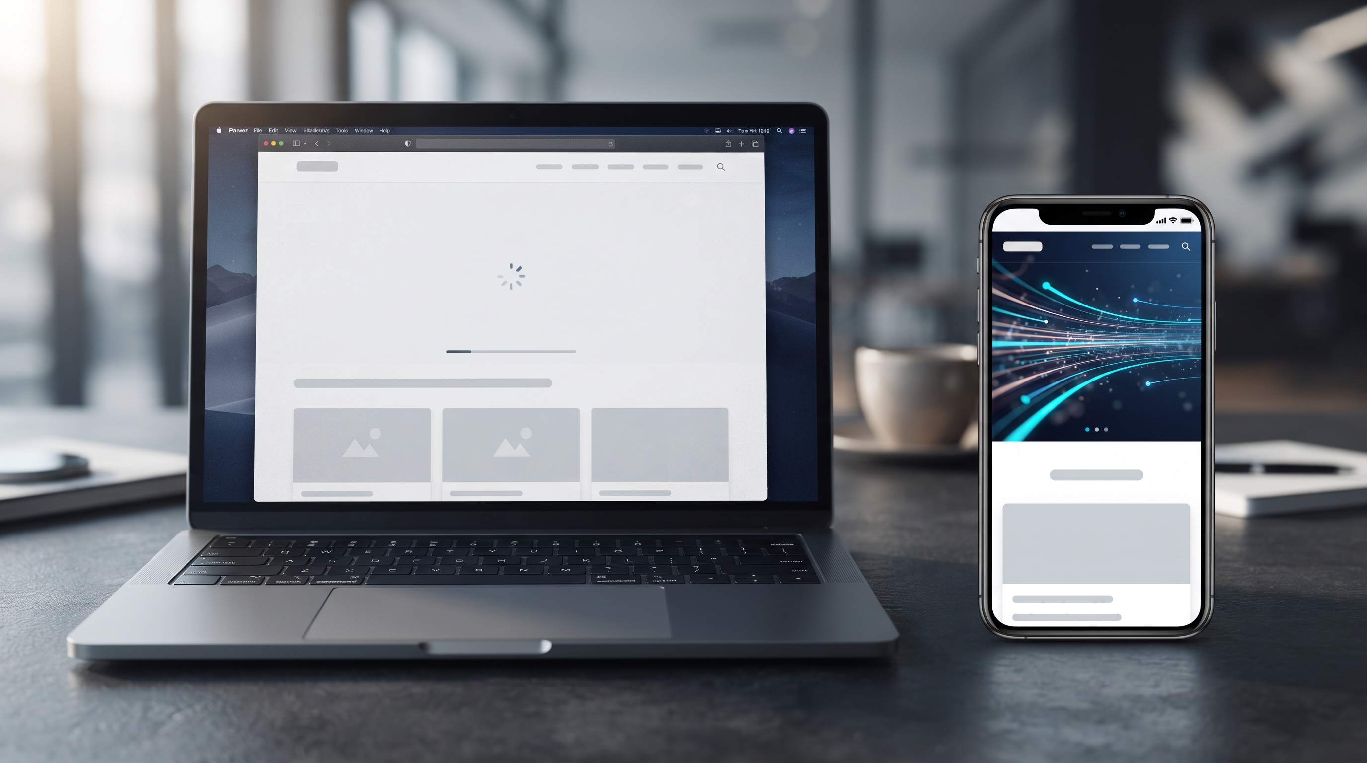







Open Your Website on Your Phone
Is Your Website Actually Mobile-Friendly?
There’s a simple test that most business owners can do right now.
Take your phone.
Open your company’s website.
Don't check it on your laptop. Don't resize your desktop browser. Open the actual website on the device your customers are likely to use.
Then look at it for a few seconds.
Can you read everything comfortably?
Can you tap the buttons without accidentally pressing something else?
Can you navigate the menu without struggling?
Do the images fit the screen?
Does the page load quickly?
Can you scroll normally without the entire layout moving sideways?
If the answer to any of these questions is no, your website probably needs a serious mobile review.
Because having a website that technically works on a phone isn't the same thing as having a website that was properly designed for mobile users.
And that difference can affect both your customers' experience and your visibility in Google.
Your Customer Probably Isn't Sitting at a Laptop
Think about how people actually discover businesses today.
Someone sees your company on Instagram.
They receive your WhatsApp number.
A friend sends them your website.
They search for your service on Google.
They click an ad.
They scan a QR code.
What device are they holding?
Very often, it's their phone.
Globally, mobile devices accounted for 49.34% of web usage in August 2026, according to StatCounter's worldwide data. In Egypt, mobile represented about 67% of web usage during the same period. StatCounter's figures are based on page views across its network of more than one million websites, so they aren't a measurement of every website on the internet, but they illustrate how important mobile browsing is. (StatCounter Global Stats)
So when someone says:
“The website looks perfect on my computer.”
That doesn't answer the most important question.
How does it feel on a phone?
Mobile-Friendly Isn't the Same as Mobile-Optimized
A lot of websites technically qualify as “responsive.”
The layout shrinks.
The columns stack.
The menu becomes a hamburger icon.
The website fits inside the screen.
Done.
Except it isn't always done.
A website can technically fit on a mobile screen and still provide a frustrating experience.
For example:
The text may be too small.
Buttons may be difficult to tap.
Important information may be buried.
Images may take too long to load.
Navigation may be confusing.
Pop-ups may cover the content.
Forms may be uncomfortable to complete.
Product cards may become too cramped.
The checkout process may be frustrating.
Animations may make the page feel slow.
Users may have to scroll excessively.
The page may still accidentally overflow horizontally.
That's the difference between responsive web design and genuinely thoughtful mobile website design.
Responsive design makes the layout adapt.
Good mobile UX asks whether the entire experience makes sense on a small screen.
Start With the Simplest Test: Can You Read It?
Open your website on your phone and look at the first screen.
Can you immediately understand:
Who is this company?
What do they offer?
Why should I care?
What should I do next?
If your visitor has to pinch the screen and zoom in before they can understand your headline, something has gone wrong.
Your customer shouldn't have to work to consume basic information.
Text should be readable.
Headings should have a clear hierarchy.
Paragraphs should have enough spacing.
Buttons should be easy to identify.
Important information should be visually prioritized.
And the experience should feel natural without requiring the user to constantly zoom, rotate their phone, or fight with the interface.
Google itself includes whether content displays well on mobile devices as one of the questions website owners should consider when evaluating page experience. (Google for Developers)
Small Buttons Create Big Problems
Here's another test.
Try using your website with one hand.
Can you comfortably tap:
The main CTA?
The menu?
Contact buttons?
Product options?
Form fields?
Navigation links?
Checkout controls?
On desktop, a mouse pointer gives you precise control.
On a phone, your finger doesn't.
That changes how interfaces should be designed.
A button that feels perfectly sized on a desktop can feel frustratingly small on mobile.
And when several links are placed close together, users can easily tap the wrong one.
This becomes especially important for businesses where the website's goal is to generate an action.
For example:
Request a Quote
Book a Consultation
Call Now
Send a Message
Buy Now
Get Started
If the customer wants to take that action but struggles to tap the button, your design is creating unnecessary friction.
Don't Make Your Customer Zoom
This sounds obvious.
Yet it's still common.
A website loads and the user immediately has to pinch and zoom because:
The font is too small.
A table is too wide.
A form doesn't fit.
An image contains important information that can't be read.
A desktop-style layout has been squeezed onto a phone.
That creates a simple psychological reaction:
“This website is difficult to use.”
And once that happens, the visitor may not stick around long enough to discover how good your company actually is.
Your website should adapt the information to the screen—not simply shrink the desktop version until everything technically fits.
Horizontal Scrolling Is a Warning Sign
Try this:
Swipe vertically through your website.
Does the page stay within the width of the screen?
Or can you accidentally drag it left and right?
If you're seeing unexpected horizontal scrolling, there may be an issue with the responsive layout.
It can happen because of:
Oversized images
Fixed-width elements
Large tables
Poorly configured containers
Long unbroken text
Embedded content
Incorrect CSS
Desktop-oriented components
Third-party widgets
A user shouldn't have to fight the page to move through it.
Vertical scrolling is normal.
Unexpected horizontal scrolling is usually something worth investigating.
Your Images Need to Work on Mobile Too
Large, beautiful images can make a desktop website look impressive.
But mobile changes the equation.
A huge image can consume a significant amount of bandwidth.
If the original image is unnecessarily large, the browser may have to download much more data than the visitor actually needs.
The result?
A slower page.
And the problem becomes even more noticeable when the user is on a slower connection or has limited data.
This is why image optimization should be part of website development.
That can include:
Choosing appropriate image dimensions
Compressing images
Using modern image formats where appropriate
Avoiding unnecessarily huge assets
Lazy-loading images when appropriate
Serving suitable image sizes for different screens
The goal isn't to make your website visually boring.
It's to make the visuals work efficiently.
A Beautiful Animation Isn't Worth a Frustrated Customer
This is especially relevant for modern websites.
Animations can be great.
Micro-interactions can be great.
Scrolling effects can be great.
Motion can help create a memorable brand experience.
But there's a difference between:
“This animation improves the experience.”
and
“This animation exists because it looks cool.”
If a visitor has to wait for a complicated animation before they can access basic information, the design may be working against the business.
The same applies to heavy JavaScript, unnecessary effects, oversized video backgrounds, and excessive third-party scripts.
A premium website doesn't need to move constantly to feel premium.
Sometimes the most sophisticated experience is simply:
fast, clear, smooth, and intentional.
Website Speed Matters on Mobile
Now wait for your website to load.
Not on your office Wi-Fi.
Try it on your phone.
The difference can be surprising.
Mobile users may be dealing with:
Slower connections
Congested networks
Limited data
Older devices
Battery constraints
Less powerful processors
That's why performance needs to be considered during development rather than treated as something to fix at the end.
Google's current page-experience guidance specifically recommends paying attention to Core Web Vitals and whether content displays well on mobile devices. Google also makes an important distinction: strong Core Web Vitals can contribute to search success and a better experience, but a perfect score by itself doesn't guarantee top Google rankings. (Google for Developers)
In other words:
Don't optimize for a score. Optimize for the person using the website.
Mobile SEO and User Experience Are Connected
Mobile optimization isn't only about making customers happier.
It also intersects with SEO.
Google's systems evaluate page experience alongside many other factors, and Google's documentation explicitly recommends ensuring that pages display well on mobile devices. (Google for Developers)
But don't make the mistake of thinking:
“I'll make my website mobile-friendly because Google wants it.”
That's the wrong mindset.
Your real reason should be:
Your customers are using mobile devices.
SEO is simply another reason to take that experience seriously.
A website that is difficult to use on mobile can create friction before the visitor even understands your offer.
Your Mobile Menu Deserves More Attention
Desktop navigation gives you plenty of space.
You might have:
Home | About | Services | Case Studies | Blog | Contact
On a phone, that same navigation needs to be condensed.
This is where mobile menus often become frustrating.
A good mobile menu should make it easy to answer:
Where can I go?
What does this company offer?
How do I contact them?
How do I get back?
The menu doesn't need to contain every possible link.
It needs to prioritize what matters.
If your mobile navigation requires five taps to find a basic service page, it's worth reconsidering the structure.
Forms Are Often Forgotten
Imagine your website generates leads through a contact form.
On desktop, the form looks perfect.
Then you open it on a phone.
The fields are tiny.
The keyboard covers half the screen.
The dropdown is difficult to use.
The form has twelve required fields.
The error message appears somewhere you can't see.
And after filling everything out, the submit button is barely visible.
You've just created a conversion problem.
Mobile forms should be designed around the realities of mobile interaction.
Ask yourself:
Do we really need every field?
If a customer only needs to provide their name, email, phone number, and message, don't make them complete a form that feels like a government application.
Every additional step creates another opportunity for the visitor to leave.
E-commerce Websites Have Even More at Stake
For an e-commerce business, mobile UX becomes even more important.
Your customer may discover a product on their phone, open the product page, choose a variation, add it to their cart, enter their information, select a payment method, and complete the purchase—all from one small screen.
That means you need to pay attention to:
Product image size
Product information hierarchy
Variant selection
Add-to-cart buttons
Cart visibility
Checkout fields
Payment options
Shipping information
Error handling
Loading states
Sticky navigation where appropriate
A beautiful product page doesn't help much if the customer can't comfortably complete the purchase.
The same principle applies to booking websites, marketplaces, SaaS products, and any website where the user needs to complete a process.
Mobile Design Should Start at the Beginning
One of the biggest mistakes a business can make is:
Build the desktop website first → finish everything → make it responsive.
That can work for some projects, but it often creates compromises.
A better approach is to consider mobile during the planning and design process.
Before development, ask:
What is the most important information on mobile?
What does the user need to see first?
What actions matter most?
Which elements can be simplified?
Which content needs to remain visible?
How should the navigation work?
How should forms behave?
How will images scale?
How much animation is actually necessary?
How quickly should the page become usable?
These decisions are much easier to make before the website is built.
Don't Design Mobile as a Smaller Desktop
This is one of the most important principles.
Mobile isn't simply:
Desktop − 70%
It is a different interaction environment.
On desktop, you have:
A large screen
A mouse
More horizontal space
Multiple visible navigation options
More room for complex layouts
On mobile, you have:
A small screen
Touch interaction
Vertical scrolling
Limited visible content
Different usage contexts
Someone might be standing in a store.
Sitting in a taxi.
Waiting for a meeting.
Walking somewhere.
Using one hand.
Dealing with a slow connection.
Your website has to work within that reality.
That's why good mobile-first web design is about prioritization.
What matters most?
Put it first.
What can wait?
Move it lower.
What isn't necessary?
Remove it.
Test Your Website on a Real Phone
Browser developer tools are useful.
Responsive design previews are useful.
Automated testing is useful.
But don't stop there.
Take an actual phone and use your website like a customer.
Don't just visit the homepage.
Try to complete the actual customer journey.
For example:
If you're a service company:
Google your service → open your website → find the service → understand the offer → check proof → request a quote.
If you're an e-commerce store:
Open a product → select a variation → add it to cart → begin checkout → complete the purchase.
If you're a restaurant:
Find the menu → check the information → find the location → make a reservation or contact the restaurant.
If you're a SaaS company:
Understand the product → explore pricing → create an account or request a demo.
That's the real test.
Not:
“Does the homepage look okay?”
But:
“Can a real customer accomplish what they came here to do?”
A Quick Mobile Website Audit
You can check your website yourself in a few minutes.
Open it on your phone and go through this list.
Readability
Is the text comfortable to read?
Are headings clearly visible?
Are paragraphs easy to scan?
Navigation
Is the menu easy to understand?
Can users reach important pages quickly?
Is the back-and-forth navigation intuitive?
Buttons
Are buttons easy to tap?
Are important CTAs obvious?
Are links too close together?
Layout
Does anything overflow horizontally?
Are images properly scaled?
Are sections too crowded?
Performance
Does the page load quickly?
Are animations delaying the experience?
Are images unnecessarily heavy?
Forms
Are fields easy to fill?
Does the keyboard interfere with the interface?
Are errors clearly communicated?
Conversion
Can visitors easily contact you?
Can they request a quote?
Can they buy, book, or sign up?
Content
Can visitors understand your offer without zooming?
Is the most important information easy to find?
Are there unnecessary walls of text?
If you find several problems, don't simply tell yourself:
“We'll fix it later.”
Those small problems are exactly what make a website feel poorly designed.
The Goal Isn't Just a Responsive Website
There is a difference between:
“Our website works on mobile.”
and:
“Our website was designed around how customers actually use mobile.”
The first is a technical statement.
The second is a business decision.
A strong mobile website should feel:
Fast.
Clear.
Comfortable.
Easy to navigate.
Easy to read.
Easy to interact with.
And most importantly:
Easy to take action on.
Because your customer isn't opening your website to admire your code.
They're opening it because they want something.
They want information.
They want an answer.
They want a product.
They want a service.
They want a quote.
They want to contact you.
Your website needs to help them get there.
Don't Make the Customer Open a Laptop
This is the simplest way to think about it.
Your customer shouldn't have to think:
“I'll check this website properly when I get home and open my laptop.”
They probably won't.
If the website is difficult to use on the device already in their hand, you've introduced friction at exactly the moment when they're trying to learn more about your business.
And you may lose the opportunity before they even understand what you offer.
So open your website on your phone today.
Look at it like a customer—not like the person who built it.
If the font is too small, fix it.
If the buttons are too small, fix them.
If there's horizontal scrolling, investigate it.
If the menu is frustrating, redesign it.
If the images are slow, optimize them.
If the website feels slow, improve the performance.
And if the entire experience feels like a compressed desktop website rather than a genuinely mobile experience, it may be time to rethink the design.
Your website doesn't just need to work on mobile. It needs to work well on mobile.
If you're not sure whether your website is giving customers the experience it should, book a free website review with Vauxite and let's take a closer look.
Follow Vauxite — and stay one step ahead.
افتح موقع الويب الخاص بك على هاتفك
هل موقع الويب الخاص بك متوافق بالفعل مع الجوّال؟
هناك اختبار بسيط يمكن لمعظم أصحاب الأنشطة التجارية إجراؤه الآن.
خذ هاتفك.
افتح موقع الويب الخاص بشركتك.
لا تتحقق من ذلك على الكمبيوتر المحمول. لا تقم بتغيير حجم متصفح سطح المكتب الخاص بك. افتح موقع الويب الفعلي على الجهاز الذي من المحتمل أن يستخدمه عملاؤك.
ثم انظر إليه لبضع ثوان.
هل يمكنك قراءة كل شيء بشكل مريح؟
هل يمكنك النقر على الأزرار دون الضغط على شيء آخر عن طريق الخطأ؟
هل يمكنك التنقل في القائمة دون معاناة؟
هل تناسب الصور الشاشة؟
هل يتم تحميل الصفحة بسرعة؟
هل يمكنك التمرير بشكل طبيعي دون أن يتحرك التخطيط بالكامل جانبًا؟
إذا كان الإجابة على أي من هذه الأسئلة هي لا، ربما يحتاج موقعك على الويب إلى مراجعة جادة للجوال.
لأن امتلاك موقع ويب يعمل من الناحية الفنية على الهاتف ليس هو نفسه وجود موقع ويب مصمم بشكل مناسب لمستخدمي الجوال.
ويمكن أن يؤثر هذا الاختلاف على كل من تجربة عملائك وظهورك في Google.
من المحتمل أن عميلك لا يجلس في مكان ما الكمبيوتر المحمول
فكر في كيفية اكتشاف الأشخاص فعليًا للأنشطة التجارية اليوم.
يرى شخص ما شركتك على Instagram.
ويحصلون على رقم WhatsApp الخاص بك.
يرسل لهم أحد الأصدقاء موقع الويب الخاص بك.
يبحثون عن خدمتك على Google.
ينقرون على إعلان.
ويقومون بمسح رمز الاستجابة السريعة ضوئيًا.
ما الجهاز الذي يحملونه؟
في كثير من الأحيان، يكون هذا الجهاز ملكهم الهاتف.
على مستوى العالم، شكلت الأجهزة المحمولة 49.34% من استخدام الويب في أغسطس 2026، وفقًا لبيانات StatCounter العالمية. وفي مصر، مثّل الهاتف المحمول حوالي 67% من استخدام الويب خلال نفس الفترة. تعتمد أرقام StatCounter على مشاهدات الصفحة عبر شبكتها التي تضم أكثر من مليون موقع ويب، لذا فهي ليست قياسًا لكل موقع ويب على الإنترنت، ولكنها توضح مدى أهمية التصفح عبر الهاتف المحمول. (StatCounter Global Stats)
فعندما يقول شخص ما:
"يبدو موقع الويب مثاليًا على جهاز الكمبيوتر الخاص بي."
فهذا لا يجيب على السؤال الأكثر أهمية.
كيف يبدو الأمر على الهاتف؟
التوافق مع الجوّال ليس هو نفسه المتوافق مع الجوّال
تتأهل الكثير من مواقع الويب من الناحية الفنية لـ "مستجيب."
ينكمش التخطيط.
تكديس الأعمدة.
تتحول القائمة إلى رمز همبرغر.
يتم وضع موقع الويب داخل الشاشة.
تم.
إلا أنه لا يتم ذلك دائمًا.
يمكن أن يتناسب موقع الويب من الناحية الفنية مع شاشة الهاتف المحمول ولكنه لا يزال يوفر تجربة محبطة.
على سبيل المثال:
قد يكون النص أيضًا صغيرة.
قد يكون من الصعب النقر على الأزرار.
قد تكون المعلومات المهمة مخفية.
قد يستغرق تحميل الصور وقتًا طويلاً.
قد يكون التنقل مربكًا.
قد تغطي النوافذ المنبثقة المحتوى.
قد يكون إكمال النماذج غير مريح.
قد تصبح بطاقات المنتج ضيقة للغاية.
قد تكون عملية الدفع غير مريحة محبط.
قد تجعل الرسوم المتحركة الصفحة تبدو بطيئة.
قد يضطر المستخدمون إلى التمرير بشكل مفرط.
قد تستمر الصفحة في التدفق أفقيًا عن غير قصد.
هذا هو الفرق بين تصميم الويب سريع الاستجابة وتصميم موقع الويب للجوال المدروس حقًا.
التصميم سريع الاستجابة يجعل التخطيط قابلاً للتكيف.
تسأل تجربة المستخدم الجيدة للجوال عما إذا كانت التجربة بأكملها منطقية أم لا. شاشة صغيرة.
ابدأ بأبسط اختبار: هل يمكنك قراءته؟
افتح موقع الويب الخاص بك على هاتفك وانظر إلى الشاشة الأولى.
هل يمكنك أن تفهم على الفور:
من هي هذه الشركة؟
ماذا تقدم؟
لماذا يجب أن أهتم؟
ماذا يجب أن أفعل؟ بعد ذلك؟
إذا كان على الزائر الضغط على الشاشة وتكبيرها قبل أن يتمكن من فهم العنوان الرئيسي، فهذا يعني أن هناك خطأ ما.
لا ينبغي أن يضطر عميلك إلى العمل لاستهلاك المعلومات الأساسية.
يجب أن يكون النص قابلاً للقراءة.
يجب أن يكون للعناوين تسلسل هرمي واضح.
يجب أن تحتوي الفقرات على مسافات كافية.
يجب أن تكون الأزرار سهلة القراءة. تحديد الهوية.
يجب إعطاء الأولوية للمعلومات المهمة بشكل مرئي.
ويجب أن تبدو التجربة طبيعية دون مطالبة المستخدم بالتكبير أو التدوير باستمرار للهاتف أو القتال مع الواجهة.
يتضمن Google نفسه ما إذا كان المحتوى سيتم عرضه جيدًا على أجهزة الجوال كأحد الأسئلة التي يجب على مالكي مواقع الويب أخذها في الاعتبار عند تقييم تجربة الصفحة. (Google for Developers)
الأزرار الصغيرة تخلق مشكلات كبيرة
إليك اختبار آخر.
حاول استخدام موقع الويب الخاص بك بيد واحدة.
هل يمكنك النقر بشكل مريح على:
الحث على اتخاذ إجراء الرئيسي؟
القائمة؟
أزرار الاتصال؟
خيارات المنتج؟
حقول النموذج؟
التنقل الروابط؟
عناصر التحكم في الخروج؟
على سطح المكتب، يمنحك مؤشر الماوس تحكمًا دقيقًا.
على الهاتف، لا يفعل ذلك إصبعك.
وهذا يغير كيفية تصميم الواجهات.
قد يبدو الزر الذي يبدو بحجمه المثالي على سطح المكتب صغيرًا بشكل محبط على الهاتف المحمول.
وعند وضع عدة روابط بالقرب من بعضها البعض، يمكن للمستخدمين النقر بسهولة على الرابط الخطأ.
يصبح هذا مهمًا بشكل خاص للأنشطة التجارية حيث هدف موقع الويب هو إنشاء إجراء.
على سبيل المثال:
اطلب عرض أسعار
احجز استشارة
اتصل الآن
أرسل رسالة
اشتر الآن
ابدأ
إذا كان العميل يريد اتخاذ هذا الإجراء ولكنه يجد صعوبة في النقر عليه الزر، فإن تصميمك يخلق احتكاكًا غير ضروري.
لا تجعل عميلك يقوم بالتكبير
يبدو هذا واضحًا.
إلا أنه لا يزال شائعًا.
يتم تحميل موقع الويب ويجب على المستخدم على الفور تقريبه وتكبيره بسبب:
الخط صغير جدًا.
الجدول واسع جدًا.
النموذج غير مناسب.
تحتوي الصورة على معلومات مهمة لا يمكن تصغيرها. قراءة.
تم ضغط تخطيط على شكل سطح المكتب على الهاتف.
وهذا يخلق رد فعل نفسي بسيط:
"هذا الموقع صعب الاستخدام".
وبمجرد حدوث ذلك، قد لا يبقى الزائر لفترة كافية لاكتشاف مدى جودة شركتك فعليًا.
يجب أن يقوم موقع الويب الخاص بك بتكييف المعلومات مع الشاشة - وليس مجرد تقليص إصدار سطح المكتب حتى يتناسب كل شيء تقنيًا.
أفقي التمرير هو علامة تحذير
جرّب ما يلي:
قم بالتمرير عموديًا خلال موقع الويب الخاص بك.
هل تظل الصفحة ضمن عرض الشاشة؟
أو يمكنك سحبها عن طريق الخطأ إلى اليسار واليمين؟
إذا كنت ترى تمريرًا أفقيًا غير متوقع، فقد تكون هناك مشكلة في التخطيط سريع الاستجابة.
يمكن أن يحدث ذلك بسبب:
كبير الحجم الصور
عناصر ذات عرض ثابت
جداول كبيرة
حاويات سيئة التهيئة
نص طويل غير منقطع
محتوى مضمن
CSS غير صحيح
مكونات موجهة لسطح المكتب
أدوات تابعة لجهات خارجية
يجب ألا يضطر المستخدم إلى محاربة الصفحة للتنقل خلالها ذلك.
التمرير العمودي أمر طبيعي.
عادةً ما يكون التمرير الأفقي غير المتوقع أمرًا يستحق التحقيق.
تحتاج صورك إلى العمل على الهاتف المحمول أيضًا
يمكن للصور الكبيرة والجميلة أن تجعل موقع ويب سطح المكتب يبدو مثيرًا للإعجاب.
لكن الهاتف المحمول يغير المعادلة.
يمكن أن تستهلك الصورة الضخمة قدرًا كبيرًا من النطاق الترددي.
إذا كانت الصورة الأصلية كبيرة بلا داعٍ، فقد يكون المتصفح يتعين عليك تنزيل بيانات أكثر بكثير مما يحتاجه الزائر فعليًا.
النتيجة؟
صفحة أبطأ.
وتصبح المشكلة أكثر وضوحًا عندما يكون المستخدم على اتصال أبطأ أو لديه بيانات محدودة.
ولهذا السبب يجب أن يكون تحسين الصورة جزءًا من تطوير موقع الويب.
يمكن أن يتضمن ذلك:
اختيار أبعاد الصورة المناسبة
ضغط الصور
استخدام تنسيقات الصور الحديثة عندما يكون ذلك مناسبًا
تجنب الأصول الضخمة غير الضرورية
التحميل البطيء للصور عند الاقتضاء
تقديم أحجام صور مناسبة لشاشات مختلفة
الهدف ليس جعل موقع الويب الخاص بك مملًا بصريًا.
بل جعل العناصر المرئية تعمل بكفاءة.
الرسوم المتحركة الجميلة لا تستحق الإحباط. العميل
يرتبط هذا بشكل خاص بمواقع الويب الحديثة.
يمكن أن تكون الرسوم المتحركة رائعة.
يمكن أن تكون التفاعلات الدقيقة رائعة.
يمكن أن تكون تأثيرات التمرير رائعة.
يمكن أن تساعد الحركة في إنشاء تجربة علامة تجارية لا تُنسى.
ولكن هناك فرق بين:
"تعمل هذه الرسوم المتحركة على تحسين التجربة."
و
"هذه الرسوم المتحركة موجود لأنه يبدو رائعًا."
إذا كان على الزائر انتظار رسم متحرك معقد قبل أن يتمكن من الوصول إلى المعلومات الأساسية، فقد يعمل التصميم ضد العمل.
وينطبق الشيء نفسه على جافا سكريبت الثقيلة، والتأثيرات غير الضرورية، وخلفيات الفيديو كبيرة الحجم، والنصوص المفرطة للجهات الخارجية.
لا يحتاج موقع الويب المتميز إلى التحرك باستمرار ليشعر بأنه متميز.
في بعض الأحيان تكون التجربة الأكثر تطورًا هي ببساطة:
سريعة وواضحة سلسة ومتعمدة.
سرعة موقع الويب مهمة على الهاتف المحمول
انتظر الآن حتى يتم تحميل موقع الويب الخاص بك.
ليس على شبكة Wi-Fi في مكتبك.
جربه على هاتفك.
يمكن أن يكون الفرق مفاجئًا.
قد يتعامل مستخدمو الهاتف المحمول مع:
اتصالات أبطأ
شبكات مزدحمة
محدودية البيانات
الأجهزة القديمة
قيود البطارية
المعالجات الأقل قوة
لهذا السبب يجب أخذ الأداء في الاعتبار أثناء التطوير بدلاً من التعامل معه كشيء يجب إصلاحه في النهاية.
توصي إرشادات تجربة الصفحة الحالية من Google على وجه التحديد بالاهتمام بمؤشرات أداء الويب الأساسية وما إذا كان المحتوى يتم عرضه جيدًا على أجهزة الجوال. يُجري Google أيضًا تمييزًا مهمًا: يمكن أن تساهم مؤشرات أداء الويب الأساسية القوية في نجاح البحث والحصول على تجربة أفضل، ولكن النتيجة المثالية في حد ذاتها لا تضمن أعلى تصنيفات Google. (Google for Developers)
بعبارة أخرى:
لا تعمل على تحسين النتيجة. قم بالتحسين بما يناسب الشخص الذي يستخدم موقع الويب.
ارتباط تحسين محركات البحث للجوال وتجربة المستخدم
لا يقتصر تحسين الجوّال على جعل العملاء أكثر سعادة.
إنه يتقاطع أيضًا مع SEO.
تقوم أنظمة Google بتقييم تجربة الصفحة إلى جانب العديد من العوامل الأخرى، وتوصي وثائق Google صراحةً بضمان عرض الصفحات بشكل جيد على أجهزة الجوال. (Google for Developers)
ولكن لا ترتكب خطأ التفكير:
"سأجعل موقع الويب الخاص بي متوافقًا مع الجوّال لأن Google تريد ذلك."
هذه هي العقلية الخاطئة.
يجب أن يكون السبب الحقيقي:
يستخدم عملاؤك أجهزة الجوال.
إن تحسين محركات البحث هو ببساطة سبب آخر لأخذ هذه التجربة على محمل الجد.
أ يمكن أن يؤدي موقع الويب الذي يصعب استخدامه على الهاتف المحمول إلى حدوث احتكاك قبل أن يفهم الزائر العرض الذي تقدمه.
تستحق قائمة هاتفك المحمول المزيد من الاهتمام
يوفر لك التنقل على سطح المكتب مساحة كبيرة.
قد يكون لديك:
الصفحة الرئيسية | حول | الخدمات | دراسات الحالة | مدونة | الاتصال
على الهاتف، يجب تكثيف هذا التنقل نفسه.
وهذا هو المكان الذي غالبًا ما تصبح فيه قوائم الهاتف المحمول محبطة.
يجب أن تسهل قائمة الهاتف المحمول الجيدة الإجابة:
أين يمكنني أن أذهب؟
ماذا تقدم هذه الشركة؟
كيف أتصل بهم؟
كيف يمكنني الحصول على مرة أخرى؟
لا يلزم أن تحتوي القائمة على كل رابط محتمل.
يلزم تحديد أولويات ما يهم.
إذا كان التنقل عبر الهاتف المحمول يتطلب خمس نقرات للعثور على صفحة خدمة أساسية، فمن المفيد إعادة النظر في البنية.
غالبًا ما يتم نسيان النماذج
تخيل أن موقع الويب الخاص بك ينشئ عملاء محتملين من خلال نموذج اتصال.
على سطح المكتب، يبدو النموذج مثالي.
ثم تفتحه على الهاتف.
الحقول صغيرة.
تغطي لوحة المفاتيح نصف الشاشة.
من الصعب استخدام القائمة المنسدلة.
يحتوي النموذج على اثني عشر حقلاً مطلوبًا.
تظهر رسالة الخطأ في مكان لا يمكنك رؤيته.
وبعد ملء كل شيء، يصبح زر الإرسال بالكاد مرئيًا.
لقد قمت للتو بإنشاء تحويل المشكلة.
يجب تصميم نماذج الجوال حول واقع التفاعل عبر الهاتف المحمول.
اسأل نفسك:
هل نحتاج حقًا إلى كل مجال؟
إذا كان العميل يحتاج فقط إلى تقديم اسمه وبريده الإلكتروني ورقم هاتفه ورسالته، فلا تجعله يكمل نموذجًا يبدو وكأنه طلب حكومي.
كل خطوة إضافية تخلق فرصة أخرى للزائر للمغادرة.
مواقع التجارة الإلكترونية لديها المزيد على المحك
بالنسبة لأعمال التجارة الإلكترونية، تصبح تجربة المستخدم على الهاتف المحمول أكثر أهمية.
قد يكتشف عميلك منتجًا على هاتفه، ويفتح صفحة المنتج، ويختار شكلاً مختلفًا، ويضيفه إلى سلة التسوق الخاصة به، ويدخل معلوماته، ويحدد طريقة الدفع، ويكمل عملية الشراء — كل ذلك من شاشة صغيرة واحدة.
وهذا يعني أنك بحاجة إلى الانتباه إلى:
حجم صورة المنتج
معلومات المنتج التسلسل الهرمي
اختيار البديل
أزرار الإضافة إلى سلة التسوق
رؤية سلة التسوق
حقول الدفع
خيارات الدفع
معلومات الشحن
معالجة الأخطاء
حالات التحميل
التنقل الثابت عند الاقتضاء
لا تساعد صفحة المنتج الجميلة كثيرًا إذا لم يتمكن العميل من إكمال عملية الشراء بشكل مريح الشراء.
ينطبق المبدأ نفسه على حجز مواقع الويب، والأسواق، ومنتجات SaaS، وأي موقع ويب يحتاج المستخدم إلى إكمال العملية فيه.
يجب أن يبدأ تصميم الهاتف المحمول من البداية
أحد أكبر الأخطاء التي يمكن أن ترتكبها الشركة هو:
إنشاء موقع ويب لسطح المكتب أولاً → إنهاء كل شيء → جعله مستجيبًا.
يمكن أن ينجح ذلك مع بعض المشاريع، ولكنه غالبًا ما يؤدي إلى إنشاء التنازلات.
المنهج الأفضل هو مراعاة الهاتف المحمول أثناء عملية التخطيط والتصميم.
قبل التطوير، اسأل:
ما هي أهم المعلومات على الهاتف المحمول؟
ما الذي يحتاج المستخدم إلى رؤيته أولاً؟
ما هي الإجراءات الأكثر أهمية؟
ما هي العناصر التي يمكن تبسيطها؟
ما المحتوى الذي يجب أن يظل مرئيًا؟
كيف يجب أن يعمل التنقل؟
كيف هل يجب أن تتصرف النماذج؟
كيف سيتم قياس الصور؟
ما مقدار الرسوم المتحركة الضروري فعليًا؟
ما مدى السرعة التي يجب أن تصبح بها الصفحة قابلة للاستخدام؟
يعد اتخاذ هذه القرارات أسهل كثيرًا قبل إنشاء موقع الويب.
لا تصمم الهاتف المحمول كسطح مكتب أصغر
هذا أحد أهم المبادئ.
الجوال ليس ببساطة:
سطح المكتب − 70%
إنها بيئة تفاعل مختلفة.
على سطح المكتب، لديك:
شاشة كبيرة
ماوس
مساحة أفقية أكبر
خيارات تنقل مرئية متعددة
مساحة أكبر للتخطيطات المعقدة
على الهاتف المحمول، لديك:
شاشة صغيرة
تفاعل باللمس
عمودي التمرير
محتوى مرئي محدود
سياقات استخدام مختلفة
قد يكون هناك شخص ما واقفًا في متجر.
يجلس في سيارة أجرة.
في انتظار اجتماع.
المشي في مكان ما.
استخدام يد واحدة.
التعامل مع اتصال بطيء.
يجب أن يعمل موقع الويب الخاص بك ضمن ذلك الواقع.
ولهذا السبب فإن تصميم الويب للجوال أولاً يتعلق بتحديد الأولويات.
ما هو الأكثر أهمية؟
ضعه أولاً.
ما الذي يمكن أن ينتظر؟
حركه إلى مستوى أقل.
ما هو غير الضروري؟
قم بإزالته.
اختبر موقع الويب الخاص بك على هاتف حقيقي
أدوات مطوري المتصفح هي مفيدة.
معاينات التصميم سريعة الاستجابة مفيدة.
الاختبار التلقائي مفيد.
ولكن لا تتوقف عند هذا الحد.
استخدم هاتفًا فعليًا واستخدم موقع الويب الخاص بك مثل العميل.
لا تكتف بزيارة الصفحة الرئيسية.
حاول إكمال رحلة العميل الفعلية.
على سبيل المثال:
إذا كنت شركة خدمات:
Google الخدمة ← افتح موقع الويب الخاص بك ← ابحث عن الخدمة ← فهم العرض ← تحقق من الإثبات ← اطلب عرض أسعار.
إذا كنت متجرًا للتجارة الإلكترونية:
افتح منتجًا ← حدد شكلاً ← أضفه إلى سلة التسوق ← ابدأ الدفع ← أكمل عملية الشراء.
إذا كنت مطعمًا:
ابحث عن القائمة ← تحقق من المعلومات ← ابحث عن الموقع ← قم بالحجز أو اتصل بالمطعم.
إذا كنت شركة SaaS:
فهم المنتج ← استكشاف الأسعار ← إنشاء حساب أو طلب عرض توضيحي.
هذا هو الاختبار الحقيقي.
ليس:
"هل تبدو الصفحة الرئيسية جيدة؟"
لكن:
"هل يمكن للعميل الحقيقي إنجاز ما جاء إلى هنا للقيام به؟"
تدقيق سريع لموقع الويب للجوال
يمكنك التحقق من موقع الويب بنفسك في بضع دقائق.
افتحه على هاتفك وتصفح هذه القائمة.
سهولة القراءة
هل النص مريح للقراءة؟
هل العناوين واضحة؟
هل من السهل مسح الفقرات؟
التنقل
هل القائمة سهلة الفهم؟
هل يمكن للمستخدمين الوصول إلى الصفحات المهمة بسرعة؟
هل التنقل ذهابًا وإيابًا أمر بديهي؟
الأزرار
هل من السهل النقر على الأزرار؟
هل عبارات الحث على اتخاذ إجراء مهمة واضحة؟
هل الروابط قريبة جدًا من بعضها البعض؟
التخطيط
هل يتجاوز أي شيء أفقيًا؟
هل تم تغيير حجم الصور بشكل صحيح؟
هل الأقسام أيضًا مزدحمة؟
الأداء
هل يتم تحميل الصفحة بسرعة؟
هل الرسوم المتحركة تؤخر التجربة؟
هل الصور ثقيلة دون داعٍ؟
النماذج
هل من السهل ملء الحقول؟
هل تتداخل لوحة المفاتيح مع الواجهة؟
هل يتم توصيل الأخطاء بوضوح؟
التحويل
هل يمكن للزائرين الاتصال بك بسهولة؟
هل يمكنهم طلب عرض أسعار؟
هل يمكنهم الشراء أو الحجز أو الاشتراك؟
المحتوى
هل يمكن للزائرين فهم العرض الخاص بك دون التكبير/التصغير؟
هل من السهل العثور على المعلومات الأكثر أهمية؟
هل توجد جدران نصية غير ضرورية؟
إذا وجدت العديد من المشكلات، فلا تقل لنفسك ببساطة:
"سنصلحها" لاحقًا."
هذه المشكلات الصغيرة هي بالضبط ما يجعل تصميم موقع الويب يبدو سيئًا.
الهدف ليس مجرد موقع ويب سريع الاستجابة
هناك فرق بين:
"موقعنا على الويب يعمل على الهاتف المحمول."
و:
"تم تصميم موقعنا على الويب حول كيفية استخدام العملاء فعليًا للجوال."
الأول هو مشكلة فنية. البيان.
والثاني هو قرار تجاري.
يجب أن يكون موقع الويب القوي للجوال:
سريعًا.
واضحًا.
مريحًا.
سهل التنقل.
سهل القراءة.
سهل التفاعل. مع.
والأهم من ذلك:
سهولة اتخاذ الإجراء.
لأن عميلك لا يفتح موقع الويب الخاص بك للإعجاب بشفرتك.
إنهم يفتحونه لأنهم يريدون شيئًا ما.
إنهم يريدون معلومات.
إنهم يريدون إجابة.
إنهم يريدون منتجًا.
إنهم يريدون خدمة.
إنهم يريدون اقتباس.
إنهم يريدون الاتصال بك.
يحتاج موقع الويب الخاص بك إلى مساعدتهم في الوصول إلى هناك.
لا تجعل العميل يفتح جهاز كمبيوتر محمول
هذه هي أبسط طريقة للتفكير في الأمر.
لا ينبغي أن يفكر عميلك:
"سوف أتحقق من موقع الويب هذا بشكل صحيح عندما أعود إلى المنزل وأفتح الكمبيوتر المحمول الخاص بي."
من المحتمل أنهم لن يحدث ذلك.
إذا كان من الصعب استخدام موقع الويب على الجهاز الذي في أيديهم بالفعل، فقد أحدثت مشكلة في اللحظة التي يحاولون فيها معرفة المزيد عن نشاطك التجاري.
وقد تضيع الفرصة قبل أن يفهموا حتى ما تقدمه.
لذا افتح موقع الويب الخاص بك على هاتفك اليوم.
انظر إليه كعميل - وليس مثل الشخص الذي أنشأه.
إذا كان الخط صغيرًا جدًا، فأصلح المشكلة ذلك.
إذا كانت الأزرار صغيرة جدًا، فقم بإصلاحها.
إذا كان هناك تمرير أفقي، فتحقق منه.
إذا كانت القائمة محبطة، فأعد تصميمها.
إذا كانت الصور بطيئة، فقم بتحسينها.
إذا كان موقع الويب بطيئًا، فحسن الأداء.
وإذا كانت التجربة بأكملها تبدو وكأنها موقع ويب مضغوط لسطح المكتب بدلاً من تجربة جوال حقيقية، فقد يكون الوقت قد حان لإعادة التفكير في التصميم.
لا يحتاج موقع الويب الخاص بك إلى العمل على الهاتف المحمول فقط. يجب أن يعمل بشكل جيد على الهاتف المحمول.
إذا لم تكن متأكدًا مما إذا كان موقعك على الويب يمنح العملاء التجربة التي ينبغي لهم القيام بها، احجز مراجعة مجانية لموقع الويب باستخدام Vauxite ودعنا نلقي نظرة فاحصة.
اتبع Vauxite - وكن متقدمًا بخطوة.